In the vast landscape of information, the ability to effectively communicate data is crucial. Raw data, no matter how comprehensive, often fails to convey its true significance without proper visualization. Data visualization is the art and science of representing data graphically to uncover patterns, trends, and insights. In this article, we will delve into what are some ways of visualizing your data?, exploring various methods and tools that enable individuals and organizations to make sense of complex datasets.
What are some ways of visualizing your data?
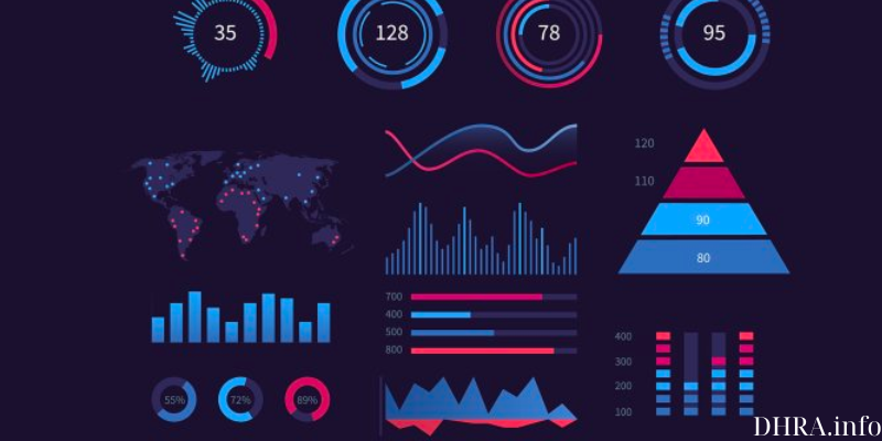
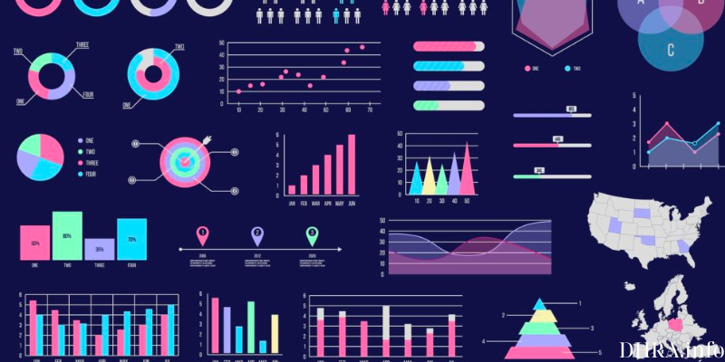
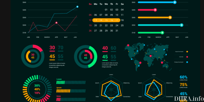
Charts and Graphs: The Bedrock of Data Visualization
Charts and Graphs: The Bedrock of Data Visualization
At the foundation of data visualization lies the use of charts and graphs. Bar charts, line graphs, scatter plots, and pie charts are some of the basic tools that help represent numerical data in a visually digestible manner. These traditional methods are accessible and widely used for their simplicity and clarity. They serve as the building blocks for more advanced visualization techniques.
Infographics: Merging Information and Design
Infographics combine visual elements, text, and images to convey complex information in a concise and engaging manner. They are particularly effective for presenting a high-level overview of data, making them popular in marketing, education, and journalism. Infographics cater to a wide audience, offering a visually appealing snapshot of information that encourages understanding without overwhelming the viewer.
Heatmaps: Revealing Patterns through Color Intensity
Heatmaps use color to represent variations in data, allowing for the identification of patterns and trends. They are commonly employed in fields such as biology, where gene expression levels can be visualized, or in business analytics to showcase website traffic and user behavior. Heatmaps are versatile and can be applied to datasets ranging from geographical information to user engagement metrics.
Interactive Dashboards: Navigating Data Dynamically
Interactive dashboards empower users to explore data dynamically. Platforms like Tableau, Power BI, and Google Data Studio enable the creation of interactive visualizations that respond to user input. This facilitates a deeper understanding of data as users can manipulate variables, apply filters, and zoom into specific details. Interactive dashboards are invaluable for decision-makers seeking real-time insights.
Tree Maps and Sunbursts: Hierarchical Data Representation
Tree maps and sunbursts are effective for visualizing hierarchical data structures. Tree maps represent data in nested rectangles, with each level of the hierarchy depicted by a different color or size. Sunbursts use concentric circles to showcase hierarchical relationships. These visualizations are beneficial in depicting organizational structures, file systems, and budget allocations.
Network Diagrams: Unveiling Connections in Complex Systems
Network Diagrams: Unveiling Connections in Complex Systems
Network diagrams visually represent relationships and connections between entities. These entities, often referred to as nodes, are linked by lines or arcs. This type of visualization is vital in fields such as social network analysis, where it helps uncover patterns of connections between individuals. Network diagrams also find applications in infrastructure management, depicting relationships between various components in a system.
Word Clouds: Visualizing Textual Data Creatively
Word clouds offer a creative approach to visualizing textual data. In a word cloud, the size of each word is proportional to its frequency in the given text. This method is commonly used in sentiment analysis, content summarization, and keyword extraction. Word clouds provide a quick and intuitive way to grasp the most prominent themes within a body of text.
3D Visualizations: Adding Depth to Data Exploration
While traditional charts and graphs exist in two dimensions, 3D visualizations add an extra layer of depth. These visualizations can enhance the understanding of spatial relationships and volumetric data. However, it’s essential to use 3D visualizations judiciously, as they can sometimes introduce complexities that may hinder rather than aid comprehension.
Augmented Reality (AR) and Virtual Reality (VR): Immersive Data Exploration
As technology advances, augmented reality and virtual reality are becoming increasingly integrated into data visualization. These immersive experiences allow users to interact with data in three-dimensional spaces. While still in the early stages of adoption, AR and VR hold great potential for fields such as medical imaging, architecture, and complex simulations.
Animations: Bringing Data to Life
Animations: Bringing Data to Life
Dynamic data visualization through animations can add a temporal dimension to static datasets. Animations help reveal trends over time, transitions between different states, and the evolution of data points. Whether used in business presentations or scientific research, animations can captivate audiences and provide a more comprehensive understanding of data dynamics.
Conclusion
In the age of information overload, the ability to extract meaningful insights from data is a valuable skill. Data visualization serves as a bridge between raw data and actionable insights, allowing individuals and organizations to make informed decisions. The methods and tools explored in this article represent a diverse array of options, each catering to specific needs and preferences. By harnessing the power of visualization, we unlock the potential to tell compelling stories with our data, ultimately empowering us to navigate the complexities of the modern world.