In the age of information overload, effective data presentation is crucial for conveying complex information in a comprehensible manner. Whether you’re a business analyst communicating insights, a teacher imparting knowledge, or a researcher presenting findings, the way data is displayed can significantly impact understanding and engagement. In this article, we will delve into various innovative ways to display data, exploring techniques that go beyond traditional charts and graphs, fostering better comprehension and interaction.
Exploring Innovative Ways to Display Data
Interactive Data Visualizations:
Innovative Ways to Display Data
Interactive charts and graphs allow users to engage with data dynamically. Tools like Tableau, D3.js, and Plotly enable the creation of visualizations that respond to user interactions, providing a more personalized and immersive experience.
Heatmaps and tree maps are effective interactive visualizations, allowing users to explore relationships and patterns by interacting with the data.
Storytelling with Data:
Narratives can be woven into data presentations to create a compelling story. Tools like Microsoft Power BI and storytelling features in data visualization platforms enable users to guide their audience through a data-driven narrative.
Combining data with real-life anecdotes or case studies can humanize the information, making it more relatable and memorable.
Augmented Reality (AR) and Virtual Reality (VR):
AR and VR technologies provide a unique way to immerse users in data environments. For instance, VR can be used to visualize three-dimensional data sets, offering a more tangible and interactive experience.
AR applications can overlay data onto the real world, enhancing situational awareness. This can be particularly useful in fields like architecture, where overlaying construction data onto a physical site can aid in planning and decision-making.
Infographics and Data Posters:
Infographics condense complex information into visually appealing, easy-to-understand graphics. Tools like Canva and Piktochart make it accessible for individuals without graphic design expertise to create visually striking infographics.
Data posters are an effective way to present comprehensive information in a single, visually cohesive display. They are particularly useful for summarizing research findings and key insights.
Motion Graphics and Animated Charts:
Incorporating motion graphics and animations can bring data to life, making it more engaging and dynamic. Animated charts can illustrate trends over time, and motion graphics can be used to explain complex processes.
Data-driven animations are effective in educational contexts, helping students grasp abstract concepts and processes through visual storytelling.
Word Clouds and Tag Clouds:
Word Clouds and Tag Clouds: Ways to Display Data
Word clouds visually represent the frequency of words in a given dataset, with the size of each word indicating its prevalence. This technique is particularly effective for text-based data, such as customer feedback or survey responses.
Tag clouds go beyond simple word frequency and provide additional information, such as sentiment analysis. This makes them valuable for understanding the overall sentiment of a set of documents or social media posts.
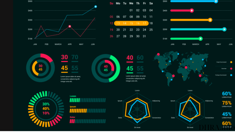
Data Dashboards:
Dashboards consolidate multiple visualizations and metrics into a single, easily digestible interface. They are commonly used in business intelligence to provide a comprehensive overview of key performance indicators (KPIs).
Customizable dashboards allow users to tailor their view, focusing on the specific metrics and data points most relevant to their needs.
3D Visualizations and Holograms:
Three-dimensional visualizations add depth to data, enabling users to explore relationships in a spatial context. This can be particularly useful in fields like geospatial analysis and medical imaging.
Holographic displays take 3D visualizations to the next level, allowing users to interact with data in a truly immersive and futuristic way. While still in its early stages, holographic technology holds promise for revolutionizing data presentation.
Augmented Data Reality (ADR):
ADR combines elements of augmented reality with data visualization, allowing users to see digital information overlaid onto the physical world. This can be applied in various fields, from education to manufacturing.
ADR can enhance training scenarios by overlaying relevant data onto real-world objects, providing a hands-on learning experience.
Data Sonification:
Data Sonification: Ways to Display Data
Data sonification involves translating data into sound, offering an auditory representation of information. This approach can be beneficial for individuals with visual impairments and can provide an alternative perspective on data analysis.
In addition to traditional charts, data sonification allows users to perceive patterns and trends through auditory cues, adding a layer of accessibility to data presentations.